Showing posts with label design. Show all posts

April 4, 2016

Wanderlust: My 10 Days Packing List for Spring in Japan


So I will be leaving to Japan in a week! Yayyyy! And this is gonna be our first travel abroad as a couple.The trip to Indonesia doesn't count cause well I am just going home, and eating yourself silly with dang delicious Indonesian food is not exactly traveling, plus my sister's husband is driving us everywhere mostly....
Anyway I think it's about time that I sorta update my travel packing-list, use my own photos to you know, really walk the talk, and just do a short post about it. If you want to check my old and more comprehensive post on what to pack just click the link here, and for more inspirations you could also click this and that
I do realized that my packing list does not differ much over the years, but I think this time I am a bit over-packed and sorta got a bit crazy on the outerwear, LOL. I don't really need three jacket, one is fine... But when I started to pack my tops and bottoms I found SOOOOO MUCH BLACK, so to inject some colors I decided to bring along a peachy faux leather jacket from ASOS, because it's Sakura season, and a red long cardigan to match the Torii (Shinto shrine gates). I would love to be all serious and  mysterious and stuff and to just wear all black everything all the time. But it doesn't really work with my personality.
The suitcase I used is just some unbranded standard carry-on as you can see above.

soooooo many pouches
In total I brought along 15 pieces (12 packed and 3 to wear), and here's the general breakdown.
Outers
- Peachy Faux Leather Jacket (O1)
- Red Long Cardigan (O2)
- Black Light Jacket (O3)

Dresses
- Fringe Dress (D1)
- Mesh Dress (D2)

Bottoms
- Black Skinny Jeans (B1)
- Black Leggings (B2)
- Denim Shorts (B3)
- Black Laser-cut Skirt (B4)

Tops
- Black Long Sleeve (T1)
- Black Tank Top (T2)
- White Tee (T3)
- Striped Tank (T4)
- Black Ruffle Tee (T5)

1 Sleepwear

I used packing cubes and pouches to organize my suitcase, you might save more space without the pouches, but this way your stuffs are more tidy and you would have less headache when pulling out or putting in clothes from and into your suitcase. It just feels much nicer for me.
Don't forget to try out your clothes before you pack and make a note on the combinations, you could either take a photo of them with your phone or make a simple note in your journal:
Anyway here's a combos that I'm gonna do:

D1   T1 + B1 + O1
D2   D1 + O2 + Scarf (not in suitcase just gonna be in my handbag)
D3   T4 + B3 + O3
D4   T3 + B3 + O2
D5   T5 + B2 + O1
D6   T1 + B4
D7   T2 + B1 + O3
D8   T3 + B1 + O3
D9   T5 + B4 + O3
D10 T1 + B2 + O1

What I have to consider also is days that I have to spend on overnight bus, so I am wearing the same bottoms and just change up the top/bottom so I feel refreshed (check-in time is 3 PM and we arrived very early in the morning).


Above is the content of my red packing cube that I used for my bottoms and sleepwear compartment. Don't forget to always put your sleepwear on top, so you can immediately change into something comfy when you are arrived in your hotel/hostel. Oh yeah, I also put my mesh dress there, I use it as a layering piece since it weights and folds into almost nothing and a great way to change up your look
And here's what inside the blue pouch.

tops and a dress, plus a  camisole and a thin stocking.

 The basic rule of savvy travel packing is do not pack what you only wear once. But I do like to break them and bring a special something, like this dress for instance, I love it soooo much, but haven't find the occasion to wear it in the hot humid heat of Cairns. So yep, it's coming with me and I must wear it!

January 5, 2012

Business Card and Logo Design for Mamaperca

Mamaperca is an on-progress website about quilting and fabrics (do check it out, it's a darling). The pic you see below is actually the early draft of the namecard design and not the finalized version (logo is okay though), but there aren't that much changes actually. And I'm just to lazy to do another one. So here goes...


For those of you who are not in the know, I AM FREELANCING AGAIN!!! 
I ACCEPT COMISSIONS... Illustration, band tees, gig posters,blog banner, logo, craft workshops, interior decor advice, or crafting something special for the one you love or whatevs, you name it.... JUST SEND E-MAIL (or food, have already start "the starving artist" issues) to yours truly.

November 20, 2011

Freebie Printables: Birds & Bees

New set of A4 paper printables y'all! (longtime right? I know.)
See it, print it, stick it, sniff it, lick it, whatevs, as many time as you like! Click here  for download.

January 23, 2011

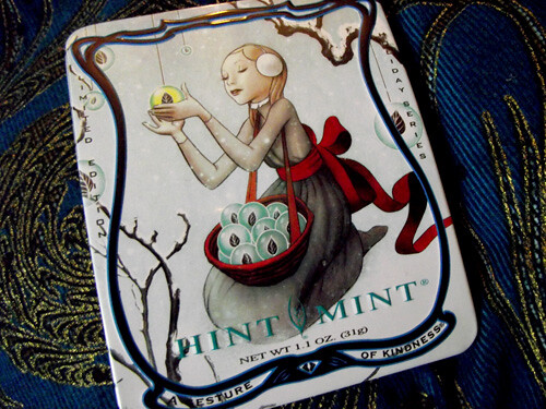
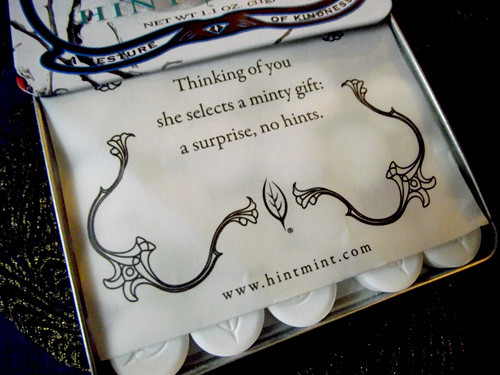
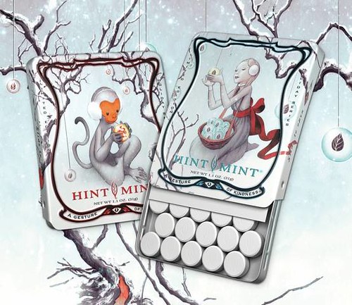
Hint Mint Holiday Edition by James Jean

I got this ultra awesome candy can from my dearest darlingest Painsugar. Isn't it just super swoony? A perfect perfect addition to my can collection. Ahh bliss....


the Jubilicious James Jean-ness

January 10, 2011

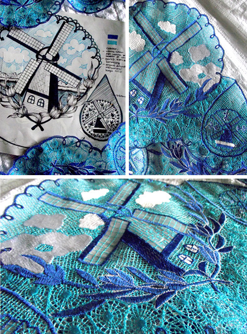
From Paper to Fabric

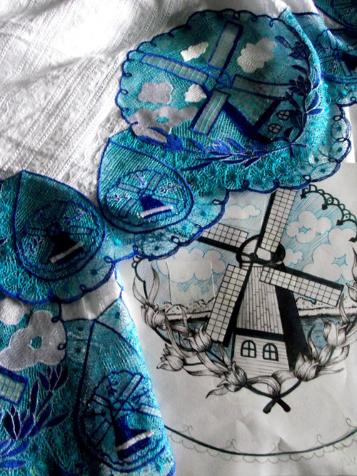
From marker pens to threads. 

Finally my long longing of seeing my design being actually done came true. It's been almost a year! Phhhewwhhh!!! These designs are for my mother's mukena (moslem prayer wear) shop, GSA Collection. I find designing for my mother as quite interesting and challenging, for there are certain rules in Islamic art that need to be applied. For instance humans and beasts are things that should be avoid of, so in Indonesia most mukenas use floral motifs instead. But as a store that brands itself of providing exclusive and limited collection, my mother demand freshness, innovation and quality to each of her product. She's a perfectionist so she is naturally very demanding. Combined with her adept social skills and business instinct she is very successful in the business. 

In the past I've done candies, trains, even musical notes. And her head embroiderer/ designer, Soleh, has done coconut trees, gold fishes, and bamboos. Due to family problems he was vacuum for over year, and he's the only one who could translate 'out-of-the-box' designs  into embroideries. While others, while very skillful in embroidering, could only follow the already made examples or create new patterns but still in floral motifs (though still unusual in terms of forms or colors, following my mother's direction, they're not THAT surprising). So my designs are just dusting away for quite some times, until now....

"Delftware"

December 26, 2010

Selamat Tahun Baru

A free desktop wallpaper (1024x768)  for you! Please click to enlarge. Feel free to share it with your friends, and a back-link if you'd be so kind : )
Happy Two Thousand eleFun Everyone!


September 15, 2010

Spice Colored Room


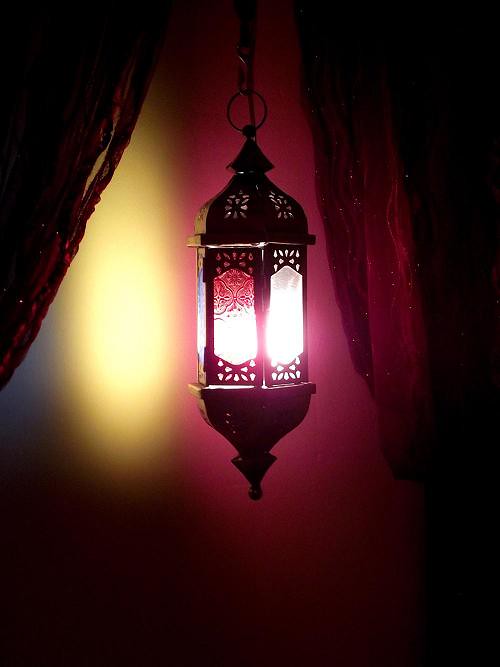
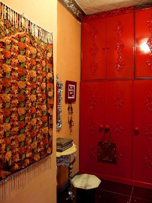
Project Bollybabe's Room is finished! Yaaayyyy!!! What she wanted is an India inspired room,being crazy about all things India that she even turned to look like one, and this is what I can deliver. She's pretty psyched about it (of course, being nowhere near the process of the oh-so-exciting activities of packing, unpacking, arguing, rearranging, etc).


She likes earth tones in rooms, and fortunately most of her "Indian stuffs" collections are of shades of oranges and reds, and that soon become the palette. Easy escapes, I know. BUT I JUST have to instill 'unexpectedness', or my life won't be complete. But not so much as surprising as Arnold Scwhatever-his-name-spelling-is in Barbie heaven  (one of my sister's room  pre-incarnation, read story here). And so there's silver......


July 16, 2010

Need Money! Employ Me!

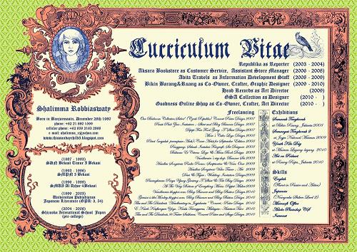
It seemed that this freelancing thing doesn't really suit my recent travel itches. So I'm planning to apply to steadier jobs. Here's my newest Hire Me Please.....

full download here
As I began to build my portfolio I came across "Buket" my zine of short stories collection from couple years ago (Yay!!!). On which you could download  here
Cerpennya dalam Bahasa Indonesia, ya teman.....  Ini cerita pembukanya. (I find myself a tad  too serious when writing in Bahasa, wonder why.....)


Buket

Kota ini hidup dari kesedihan. Langitnya selalu abu-abu dengan sentuhan aroma kemuraman. Tak ada yang suka akhir yang bahagia.
Eh bagus bukan filmnya?”
Iya tapi lebih baik dua-duanya mati di akhir cerita, lebih tragis.”
“Kenapa? Sehabis mati berkali-kali, terus hidup lagi, masakah tak diberi kesempatan buat hidup bahagia?”
“Nah, itulah masalahnya, hidup bahagia itu cuma ada di film-film dan cerita. Kenyataannya mana ada yang seperti itu.”
“Tapi aku suka saat mereka berdua membicarakan kematian si atas  ranjang.”
“Aku suka saat hidup orang-orang yang ditemuinya berubah seiring dengan perubahan keputusan yang diambil di kehidupan selanjutnya.”
Lalu hening, lamat-lamat. Kebahagiaan lebih mudah jika ia maya. Karena kenyatan selalu membenturkan diri dan memasungnya.


June 25, 2010

Work in progress: Art on Poskart

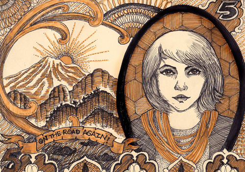
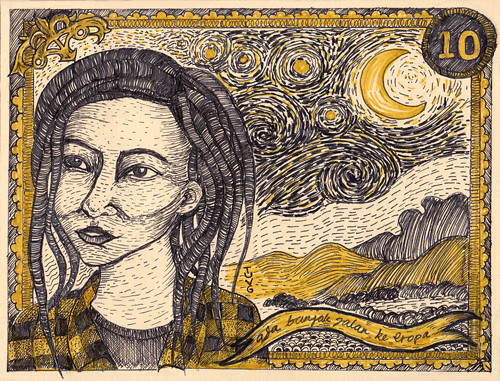
I got lucky to be invited to do a collective exhibition at Ruang Rupa by Miss V.  First I wanna submit my travel sketches, but printing it on postcard sized paper, wouldn't be as fun (they're in my journal, I usually made them while waiting for the bus, food, or whatever). So I decided to do something else. Here's what I concocted so far, I still need to do another to meet the requirements. The pieces are inspired by travel and foreign currency and so I dubbed them as "Ongkos Jalan". And Van Gogh's "Starry Night"  for the second picture.


June 14, 2010

Tika and The Dissidents Stage Decor

For the past two weeks, I've been preparing Tika and The Dissidents' concert at Teater Salihara. I really learned a lot from it, on communicating my ideas and how to modify them without compromising too much to better suit the budget and the resource available. I have my heartbreaks and back aches, but as the the stage lights began to flood the room following Kartika Jahja's soulful wail, I felt nothing but an overwhelming joy that swelled up and brought tears to my eyes. 
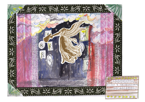
Here's the initial sketch for the stage. Tika loved the poster that I did for "Headhunting in  Jogjakarta" about  a month ago, and so we decide to evolve on that.  My basic idea was called " Cheap Thrills and Vaudeville", it's circus meets boudoir meet whatever's available.


We're using the same poster design with minor changes on the infos. Following the suggestion of Mr. Painsugar, the stage frame were simplified from four panels to just one, leaving only the top. The Salihara stage was pretty daunting for its scale, at least for us who were more familiar with small and intimate space. 
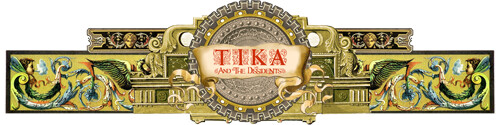
Based on the poster design, I collaged and cropped and flip-flopped Baroque-ish pictures into this.


As you can see I've expanded the sides and changed the wreath of leaves in the middle into gears to represent Tika and the Dissidents more (lefty) political lyrics. The framing sprawled about 8 m in width and 2 m in height. Thanks to the magic digital printing, we managed to create the graphic on time in our very tight schedule.

March 26, 2010

New Projects

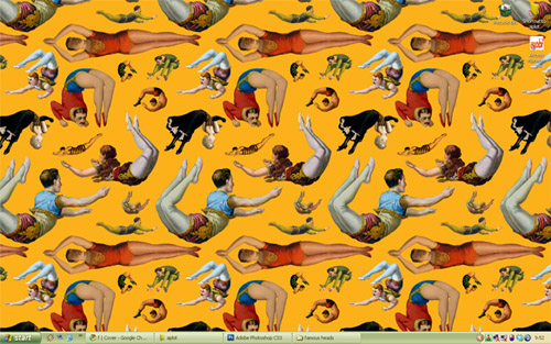
I'm on a roll.... And Voila! Three designs in a row. On which I will show shortly. But first, lookeemee desktop thingie. A wonderful, wonderful citrusy circus scene from TotallySevere. I have been hunting for carnivalesque pictures on the net for months but still couldn't find the one that's big enough (and with correct orientation) for my desktop. And so I was head over heels when I found this baby on TotallySevere. Who wouldn't want people in colorful tights jumping allover their computer screen anyway?
And these pretty much set the traceable  vibe, color preference, and mood on my current designs.


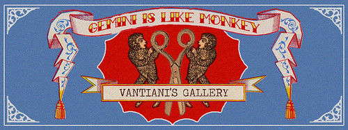
Miss V asked me to design her blog banner some faraway months ago, but silly me, I sorta forgot which. So I ended up doing two blog banners. First, for her collage-art blog "Gemini is like Monkey". The top things that came to my mind were of twins, monkeys, scissors, and that good old vintage vibe. So here's the moodboard
.

I sorta forgot where I found the two pics on the right. The pic on top-left is from WackyStuff and the gorgeous strawberry label is from GraphicsFairy, on which color combinations and lay out  I blatantly copied. And here's what I came up with.


Quick Photoshop Tips to get this look:
For the "graininess" try Filter>Texture>Grain and then reduce its saturation a bit. A shortcut for adjusting "Hue and Saturation"  is by clicking "Ctrl + U". Remember that vintagey things are never quite white, they tend to get a tad off.


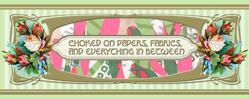
And above are the inspirations for the other banner. Miss V wanted me to include her collages or photos for her daily blog header. Sit on top of my mini gallery are two very lovely framed vintage art nouveau Talcum Powder labels that Miss V gave me (among gazillion of other stuffs for she is  very much like "the giving tree"). So I decide to  start on those, and here's what I come up with.


Quick Photoshop Tips to get this look:
I used "Drop Shadow" combined with "Bevel and Emboss" to create, well, the embossed look on the golden framing.On the Layers window, select your layer and right-click and select "Blending Options". Once the "Blending Options" window is opened ,check the little boxes beside the effects you intend to use and since there's no pan-formula you would just have  to try and tweak  few things out to get it right.


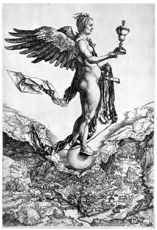
And last but definitely not least.... is the promotional poster for Tika and the Dissidents. It was a collage  of soooo many random things, so I won't even try to recreate the moodboard. The band have "the Headless Songstress" as their icon, which basically a headless angel holding a bullhorn. A very strong icon  indeed, but not so easy to work with. Anyway the gig is called "Headhunting in Jogjakarta", so I have to consider that as well.  When in doubt, go to the Old Masters, I say. After finished drooling over Albrecht Durer's "Nemesis" (above), I soon get my flow. Throw in references of  Illumination art , few famous heads, and of course, circus and Voila! 


Reblog this post [with Zemanta]

March 24, 2010

M itu untuk Mari Membaca


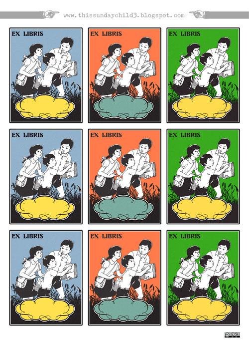
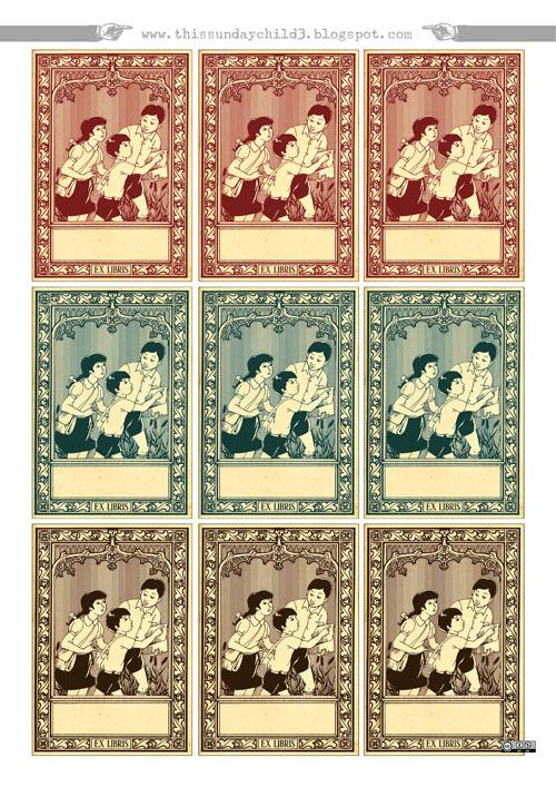
Masih ingat si Budi? Juga kakaknya si Wati? Kawan para murid Sekolah Dasar era Orba yang gemar mengajak kita belajar membaca dan menulis Bahasa Indonesia
Silahkan bernostalgia dengan label buku reka ulang si Budi dkk yang dapat kamu unduh untuk kamu cetak sendiri, sepuasnya!

The printables you will see below are renditions of  vintage elementary school mandatory book covers, with its very famous recurring character of a boy named Budi and his company that happily teach Indonesian kids to read and write. Simply follow the links to download.


March 20, 2010

Goelia Concept 225

Oleh-oleh khusus buat Miss V and Miss Lowquacity.....
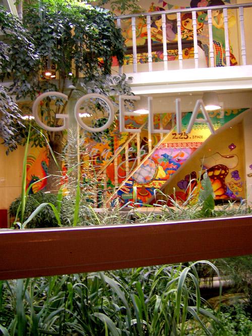
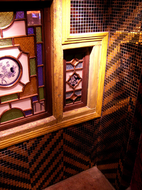
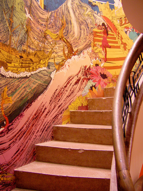
There's a mini-heaven in the busy intersection of Beijing Road and Wenming Road in Guangzhou, but it blends into its neighborhood almost too perfectly,you might miss it if you don't open your eyes wide enough to stay alert. Be on your best behavior or the two angels guarding the small stairways won't let you in ( a smile sure help).
This small sanctuary goes by the name of  Goelia Concept 225, and I was so very lucky to find it for it was, well, heavenly...


See more Guangzhou's Goodness here
Reblog this post [with Zemanta]

March 8, 2010

M is for Motif

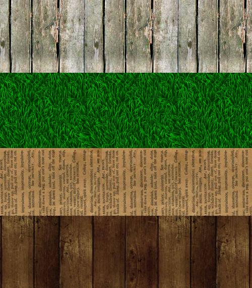
Wondering how I managed to get the gorgeous looking wooden web-wallpaper for my blog background. No? Never? Really?!
Well okay. But I don't care because I am in a very cheery charitable mood. And here's my top three recommendations of  FREE pattern websites.

There's very few of natural  looking patterns on the web. Much less are ones that are fast and easy to download (read: third-world's bandwith friendly). But one should worry not and come to the design domain of  one German gentleman called Koller. Beside realistic looking patterns under "real", there's also other easy to understand classification under this semi-bilingual website such as "dotted", "classic", and "lines". The aforementioned were simpler designs with an 8-bit-ish look to it.

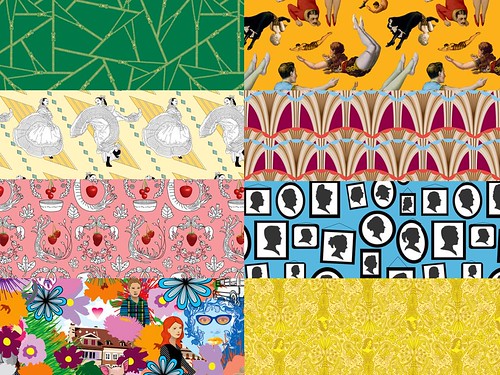
If you are deliriously delighted over Damask as I am, then Din Pattern is the place to be. This design-savvy site offers cool takes on classical patterns with user friendly interface, complete with tutorial and bitesome articles on pattern-based art and design. No wonder it's often dubbed as the best pattern resource on the web.

Totally Severe is definitely not kool. It's kooky, kitschy, and kinky. And totally awesome. And has made me instinctively hit the bookmark bar  to go to to this  weirdly wonderful website each time I logged on.  I've seen it many times before and yet I want to see it again. I want to giggle all over again since  Sarah (raised and educated by pirates)  is just  adorably hilarious (and very nice too!). And I am using too many and, aren't  I?
Her designs know no boundaries for she would hop between style periods and then managed to make it hers.  She tackles tackiness with such fervour and turn it into something gaspingly good and so gregariously gutsy. And yes, Design should be Daring! And I will be webstalking Sarah forevah!

December 19, 2009

A Belated Christmas Card Designs

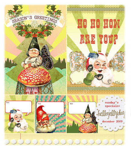
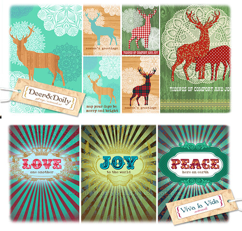
For one thing and another, I just didn't make it on time (for Etsy or local x-mas bazaar). It'll also be too late for making the printable versions. I did printed and it was gorgeous, so I am just going to post it... : ). Viva Par Avion!
hellojollydays-card set
deerdoily-theljps