For the past two weeks, I've been preparing Tika and The Dissidents' concert at Teater Salihara. I really learned a lot from it, on communicating my ideas and how to modify them without compromising too much to better suit the budget and the resource available. I have my heartbreaks and back aches, but as the the stage lights began to flood the room following Kartika Jahja's soulful wail, I felt nothing but an overwhelming joy that swelled up and brought tears to my eyes.
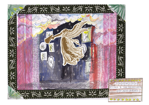
Here's the initial sketch for the stage. Tika loved the poster that I did for "Headhunting in Jogjakarta" about a month ago, and so we decide to evolve on that. My basic idea was called " Cheap Thrills and Vaudeville", it's circus meets boudoir meet whatever's available.
We're using the same poster design with minor changes on the infos. Following the suggestion of Mr. Painsugar, the stage frame were simplified from four panels to just one, leaving only the top. The Salihara stage was pretty daunting for its scale, at least for us who were more familiar with small and intimate space.
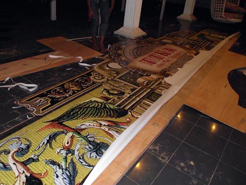
Based on the poster design, I collaged and cropped and flip-flopped Baroque-ish pictures into this.
As you can see I've expanded the sides and changed the wreath of leaves in the middle into gears to represent Tika and the Dissidents more (lefty) political lyrics. The framing sprawled about 8 m in width and 2 m in height. Thanks to the magic digital printing, we managed to create the graphic on time in our very tight schedule.
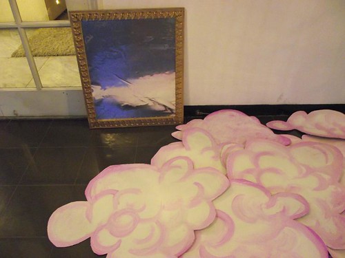
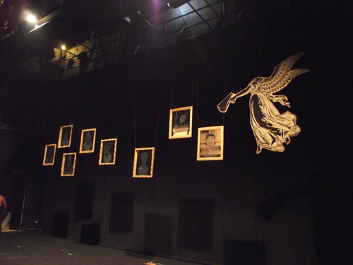
Based on safety precaution I tried to use aluminum sheetings as mirrors instead of using the real ones. But we ditched the ideaand opt for the more dangerously beautiful real things. Since the title of the show is "Headhunting", I plan to print the head artworks on transparent stickers and adhere them to the mirrors, for a more ghostly ( I hope) effect.
The frames were made using wood moldings or profiles, the things I used to embellish my wardrobe. Very budget friendly, I tell ya.In the end we have to ditched the clouds also because it was not strong enough to hold the strings of crystal mimicking drops of rain. We chose safety this time.
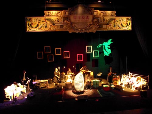
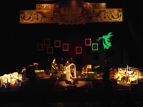
At D-Day minus 1, we started to load and build the stage. We decide to alter the original design further by moving the iconic Headless Songstress to the side instead of the middle so it won't be obstructed by Tika's eggshaped swinging chair.
Threw in a lacy bed for the background vocals, and white benches for the brass section, and here's how the final stage looked-like




SOOOOO GEORGEOUS, too bad I can't make it to the show. tell me more when we meet, will you?
ReplyDeleteDindie ke Goelali ya?
ReplyDeleteSiap!