
From marker pens to threads.
Finally my long longing of seeing my design being actually done came true. It's been almost a year! Phhhewwhhh!!! These designs are for my mother's mukena (moslem prayer wear) shop, GSA Collection. I find designing for my mother as quite interesting and challenging, for there are certain rules in Islamic art that need to be applied. For instance humans and beasts are things that should be avoid of, so in Indonesia most mukenas use floral motifs instead. But as a store that brands itself of providing exclusive and limited collection, my mother demand freshness, innovation and quality to each of her product. She's a perfectionist so she is naturally very demanding. Combined with her adept social skills and business instinct she is very successful in the business.
In the past I've done candies, trains, even musical notes. And her head embroiderer/ designer, Soleh, has done coconut trees, gold fishes, and bamboos. Due to family problems he was vacuum for over year, and he's the only one who could translate 'out-of-the-box' designs into embroideries. While others, while very skillful in embroidering, could only follow the already made examples or create new patterns but still in floral motifs (though still unusual in terms of forms or colors, following my mother's direction, they're not THAT surprising). So my designs are just dusting away for quite some times, until now....
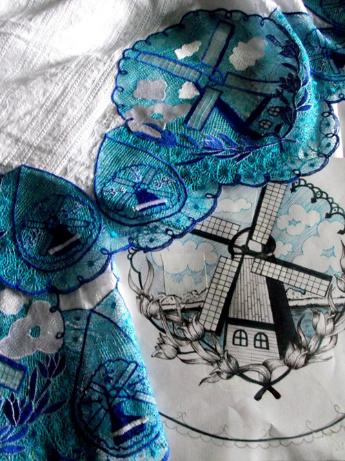 |
| "Delftware" |
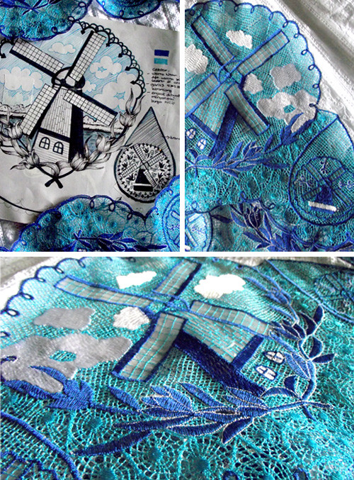
It's quite obvious where the inspiration came from isn't it? In my house they're a lot of souvenirs from Holland strewing around, I thought it would be neat to have these windmills on clothing, so that's that. The blue wasn't quite right yet, so we have to do another try, and we'll try reddish colors too in creme colored fabric.Though hasn't quite finished yet this mukena has already been booked by one of my mother loyal client. Woohoo!
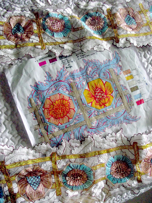
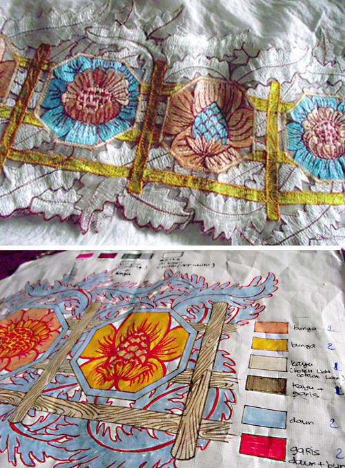
The next design is floral, but not in the common style of mukena motifs, at least that what I was hoping for. We tuned the color down on this one, I think the pastel mood works nicely. I used markers for the design so the colors were often too bright. I don't know why I call this design Isadora. Probably because I took the color tones from an Isadora Duncan poster found on Google, though I dunno which... teeheehee....
Coming up are the "Serengeti" and "Plumes" , designs that made early last year when animal prints were all the rage. Still OK though, can't wait!!!

No comments:
Post a Comment