
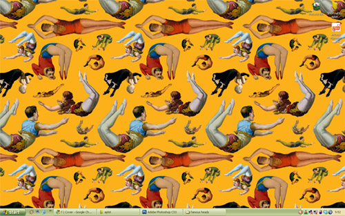
I'm on a roll.... And Voila! Three designs in a row. On which I will show shortly. But first, lookeemee desktop thingie. A wonderful, wonderful citrusy circus scene from TotallySevere. I have been hunting for carnivalesque pictures on the net for months but still couldn't find the one that's big enough (and with correct orientation) for my desktop. And so I was head over heels when I found this baby on TotallySevere. Who wouldn't want people in colorful tights jumping allover their computer screen anyway?
And these pretty much set the traceable vibe, color preference, and mood on my current designs.
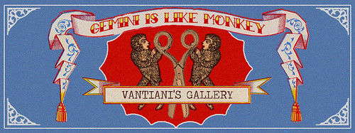
Miss V asked me to design her blog banner some faraway months ago, but silly me, I sorta forgot which. So I ended up doing two blog banners. First, for her collage-art blog "Gemini is like Monkey". The top things that came to my mind were of twins, monkeys, scissors, and that good old vintage vibe. So here's the moodboard
.

I sorta forgot where I found the two pics on the right. The pic on top-left is from WackyStuff and the gorgeous strawberry label is from GraphicsFairy, on which color combinations and lay out I blatantly copied. And here's what I came up with.
Quick Photoshop Tips to get this look:
For the "graininess" try Filter>Texture>Grain and then reduce its saturation a bit. A shortcut for adjusting "Hue and Saturation" is by clicking "Ctrl + U". Remember that vintagey things are never quite white, they tend to get a tad off.

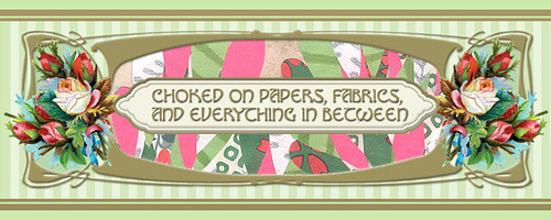
And above are the inspirations for the other banner. Miss V wanted me to include her collages or photos for her daily blog header. Sit on top of my mini gallery are two very lovely framed vintage art nouveau Talcum Powder labels that Miss V gave me (among gazillion of other stuffs for she is very much like "the giving tree"). So I decide to start on those, and here's what I come up with.
Quick Photoshop Tips to get this look:
I used "Drop Shadow" combined with "Bevel and Emboss" to create, well, the embossed look on the golden framing.On the Layers window, select your layer and right-click and select "Blending Options". Once the "Blending Options" window is opened ,check the little boxes beside the effects you intend to use and since there's no pan-formula you would just have to try and tweak few things out to get it right.
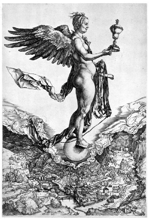
And last but definitely not least.... is the promotional poster for Tika and the Dissidents. It was a collage of soooo many random things, so I won't even try to recreate the moodboard. The band have "the Headless Songstress" as their icon, which basically a headless angel holding a bullhorn. A very strong icon indeed, but not so easy to work with. Anyway the gig is called "Headhunting in Jogjakarta", so I have to consider that as well. When in doubt, go to the Old Masters, I say. After finished drooling over Albrecht Durer's "Nemesis" (above), I soon get my flow. Throw in references of Illumination art , few famous heads, and of course, circus and Voila!

![Reblog this post [with Zemanta]](http://img.zemanta.com/reblog_c.png?x-id=77544bd8-f92f-4c85-a898-9aab52b8ff38)
Do I really have to threw in a Storm Trooper head in? Yes of course!
ReplyDeleteshali...teirmakasih untuk tutorialnya aku pengen nyoba juga ah....
ReplyDeleteThanks for the mention (again)!
ReplyDeleteIn case you're ever in need of some images, I get many of mine (including all those acrobats) from here: http://www.loc.gov/pictures/
I've seen Miss V's art before on etsy and I've been meaning to buy some postcards for weeks.
Lovely poster design! It's sooo detailed and I could stare at for a long time.
Hi Sarah....
ReplyDeleteThank you so much for the link, you're absolutely awesomeness incarnate!
and, please do buy her postcard you won't regret it.....