
After chosen the (imaginary) furnishings to fill the room with, comes the most important factor that could make or break the overall mood. The palette. *Sounds interior-decoratorish enough?*
I always wanted to paint my room black, and no it was not supposed to be spooky/ goth-icky or anything. I assume it’s just my way of declaring a total refusal on white walls. With dark background even the obvious color choices will turn any room downright dramatic. Look at these black and beautiful rooms from Apartment Therapy.
To boost my confidence and to back-up my ideas, a little research is somewhat mandatory. So I went the Google way typing keywords like” interior+decor+tips+color+scheme” and the likes. And phrases similar to “take inspiration from nature” popped up quite a lot. Agreeing silently, a single distinctive plume quickly comes to mind. Peacock’s. One of those lightbulb moments you know. I have been infatuated with peacock plumage for quite some time and been thinking to have it inked. Not only I want my room to be “pretty “ but also something I could be “proud” of, in essence my ideal would be Peacock-like.


borrowed the image from here
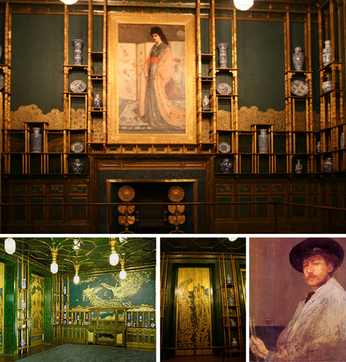
To take inspiration in art came unsurprisingly after, and I quickly hit the mother lode when I found this “Peacock Room” done by Whistler that got me dreaming of gilded ceiling. His famous paintings were mostly people wearing monochromes, muted color backgrounds, tinged with flavors of a Japanese ukiyo-e. From his rather ‘quiet’ paintings I never thought Whistler could be such a Decorating Diva. He let his artistique ego take over and baptized this masterpiece in decorative mural as “Harmony in Blue and Gold: The Peacock Room”. With such bold color choices, it was no wonder Leyland, the owner of the house who was abroad the time the project started, was furious. Before Leyland left the room to the care of Whistler he clearly underlined for only minor changes were to be made. Thus he was fired instantly. After the incident Whistler managed to sneak back in to paint two fighting peacocks unmistakably represented “the artist” and “the patron”. Don’t you just love him?
And here’s a peek of my main moodboard.
From the moodboard above I determined the color palette below. I have never tried this color combination before, bold as I might be, my heart beats fast each time I went paint picking. So fern green will be the color of the wall-to-wall wardrobe (oh yeah instead of having separate armoire and work station, we agreed to cram it all in one to save more space), and have turquoise/teal/tiffany blue-ish paint for the wall. I was psyched when I found out that Pantone announced Turquoise to be the color of 2010. Yay!

No comments:
Post a Comment